


Power Apps
Microsoft Corporation
Power Apps is the kind of business tool I appreciate more after using it in a real workday than after reading its short store description. It is an app from Microsoft Corporation that brings custom business applications to a phone or tablet, so the usefulness depends heavily on what an organization has built and how clearly that solution has been designed. In my experience, that makes it less like a single-purpose mobile app and more like a doorway into many different work processes.
I tested it with a practical question in mind: can someone with different abilities, devices, working environments, and levels of technical confidence use it without unnecessary friction? My answer is mixed but positive. The app can make field work, approvals, inspections, inventory updates, and internal forms much easier to reach. At the same time, the quality of the experience is often determined by the individual Power App behind it. A well-designed app can feel focused and efficient; a poorly designed one can be difficult even when the Power Apps shell itself opens correctly.
As a free business app rated for Everyone, it is easy to try from a personal device, although access to a particular workplace application still depends on the organization that created it. The current version is 3.26054.10, and it runs on Android seven or later. Its public reception is strong, with a 4.4 average from around forty-four thousand ratings and more than ten million installs. Those figures suggest broad adoption, but they do not remove the need to judge the individual workflow you intend to use.
How Power Apps handles readability and navigation
A useful front door, not a complete accessibility guarantee
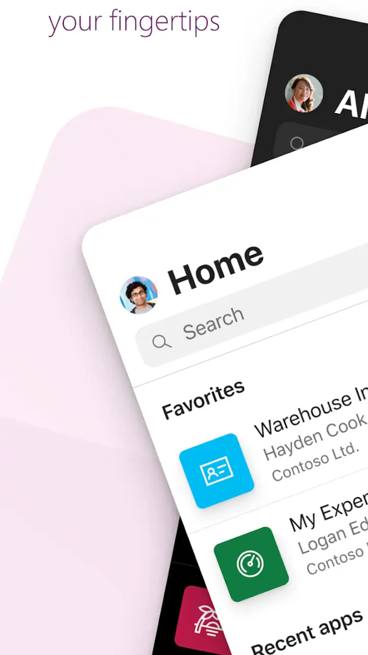
The first thing I noticed is that Power Apps is mainly a container and access point. I can open the app, sign in where required, and reach business solutions made for a particular team. That arrangement is convenient because I do not need a separate traditional app for every internal process. It is also the source of the biggest usability variation: Microsoft provides the platform, while another person or team may decide how forms, buttons, labels, menus, and error messages appear.
For readability, the most important question is therefore not simply whether the Power Apps interface looks clean. It is whether the custom app uses plain labels, sensible grouping, strong visual hierarchy, and enough space around controls. When those choices are made carefully, a worker can identify the next action quickly. When a screen contains many fields or ambiguous icons, the same user may need extra time to understand what is expected.
Related News

Why WhatsApp Messenger Still Makes Everyday Communication Feel Easy

Jurassic World: The Game Is the Better Dino Tycoon for Strategic Players

Threads in Real Life: Who Should Join, Lurk, or Leave

How SHEIN Turned Shopping Into an Endless Content Feed

How to Make Fortnite Feel Smarter on Mobile

Should You Switch to Microsoft Outlook on Mobile?
I found that short, descriptive control names are much more helpful than decorative labels. “Submit inspection” tells me what will happen; a symbol without text leaves me guessing. This is especially important for someone with limited vision, a cognitive disability, or a language-processing difficulty. A good Power Apps solution should make the task obvious before the user touches the screen.
Navigation can also change from one business app to another. Some solutions may guide me through a simple sequence, while others expose several sections at once. That flexibility is valuable for organizations with different processes, but it means users cannot rely on one universal navigation pattern. If I were introducing Power Apps to a team, I would provide a short orientation using the exact app employees need rather than assuming that familiarity with one solution will transfer perfectly to another.
Text scaling and visual clarity need real-world testing
People who enlarge text or use display settings for better visibility should test the complete workflow, not just the landing screen. Larger text can make a label easier to read, but it may also crowd a form or push an important button below the visible area. That is not a reason to avoid the app; it is a reason to inspect every critical step with the settings that each employee actually uses.
Gallery
I would pay special attention to forms with several columns, compact menus, and screens that depend on small status indicators. A color change alone should not be the only way to communicate whether something succeeded or failed. A written confirmation, a clear field label, or an obvious error message gives users another route to understand the result.
One practical tip is to ask the person who created the internal app to test it at the largest comfortable text size before deployment. This catches problems that are easy to miss on a developer’s screen. It also exposes whether the workflow depends too much on visual alignment or tiny touch targets. In my view, this is one of the most important accessibility checks because the platform’s versatility can otherwise hide design weaknesses.
For users who prefer predictable routines, the best Power Apps experiences are those that keep the number of decisions low. A delivery worker who only needs to scan an item, confirm a quantity, and report a problem should not have to navigate through unrelated administrative options. A focused screen reduces reading effort and makes the app more usable for people working under pressure.
Where it compares with ordinary business alternatives
Compared with a conventional spreadsheet on a phone, Power Apps can offer a more guided path. A spreadsheet may expose too many cells, require horizontal scrolling, or rely on the user to remember which columns matter. A custom app can present only the fields needed for a specific task. That is a genuine advantage for readability and cognitive load, provided the app has been designed with restraint.
Compared with a standard form builder, Power Apps can be more adaptable for organizations that need several connected processes rather than one questionnaire. The trade-off is that flexibility can produce more complicated screens and a less consistent experience between departments. A simple form service may be the better option for a small team that only needs to collect straightforward responses and does not want to maintain a broader app environment.
Motor, sensory, and situational use in everyday work
Touch interaction is practical, but the design decides the effort
On a phone, Power Apps is naturally suited to short actions performed with one hand: checking a record, confirming a visit, updating a status, or entering a small amount of information. That is useful for people who move between locations and cannot sit at a desk. However, the physical effort varies greatly with the custom interface. Large, well-spaced controls are easier for someone with tremors, reduced dexterity, or temporary hand strain. Dense layouts and tiny buttons make the same task unnecessarily demanding.
I would not judge a solution only by whether every control technically responds to a tap. The better test is whether a user can tap the intended control without precision that is unrealistic in a moving vehicle, a warehouse, a bright outdoor area, or a stressful customer interaction. A workflow that is comfortable at a desk may be awkward when the phone is held in one hand and the other hand is occupied.
For teams building these apps, a useful improvement is to separate destructive or final actions from ordinary navigation. If “save,” “cancel,” and “submit” sit too close together, accidental taps become more likely. A confirmation step for an irreversible action can protect users with motor difficulties, while a clear way to correct an entry prevents a small mistake from becoming a larger administrative problem.
Audio, vibration, and visual dependence
Different users work in very different sensory environments. A person may be in a noisy plant, a quiet clinic, a meeting, or a location where sound cannot be used. I would therefore avoid relying on an audible cue alone to confirm that a record was saved. The interface should also provide a visible message that remains long enough to read, especially for someone who processes information more slowly.
The reverse is equally important. In a loud environment, a small visual change may be easy to miss. A concise confirmation and a clearly changed status help users verify the outcome without depending on sound. If the business workflow includes scanning or rapid updates, the person responsible for the app should test it with background noise, gloves, bright light, and reduced attention. These conditions reveal practical barriers that a quiet office test will not.
For people with hearing differences, visual confirmation is essential. For people with low vision, text alternatives and strong structure matter more than decorative color. For users with sensory sensitivities, a calm layout with limited unnecessary movement is preferable to a crowded screen. I cannot treat any one design choice as universally best, but I can say that Power Apps makes it possible to tailor the experience when the organization takes these differences seriously.
A realistic scenario: the mobile inspection round
Imagine a facilities worker moving through several rooms to record equipment conditions. With a well-made Power App, the worker can open the assigned process, choose the location, mark the condition, add a note, and move on without carrying a clipboard. That reduces repeated writing and makes the information available to colleagues sooner. It can also help a worker who finds handwriting difficult or who benefits from a consistent sequence of prompts.
The same scenario exposes the limitations. If the app asks for too many optional details, uses unclear icons, or places the main action at the edge of the screen, the worker may spend more effort operating the interface than inspecting the equipment. If the network connection is unreliable, the worker may also become uncertain about whether an update was accepted. I would recommend a small pilot with the people who perform the inspection, including those who use accessibility settings or assistive routines, before making the workflow standard.
Situational access beyond disability
Accessibility is not limited to permanent conditions. A user with a temporary injury, a parent holding a child, or an employee wearing protective gloves may have the same need for larger controls and fewer steps. Power Apps is valuable here because a business can create a focused mobile process instead of forcing everyone to use a desktop-oriented system on a small screen.
It is also useful for mixed-device workplaces. Some employees may prefer a phone for quick updates, while others may need a larger screen for reviewing several records. The app’s minimum operating system is Android seven or later, so device compatibility should be checked against the phones a team actually owns. A free download does not by itself mean that every employee has suitable hardware, a reliable connection, or permission to reach the required workplace solution.
That last point is important for anyone deciding whether to install it. Power Apps is not a universal collection of ready-made business utilities. Its value comes from the applications available through an organization or account. If you are an individual looking for an instant invoice tracker, personal planner, or standalone stock manager, a dedicated app may be faster to understand and more complete on day one.
Remaining barriers that organizations should address
The largest barrier is inconsistency. Two Power Apps solutions can feel completely different because different creators choose different layouts and levels of guidance. One may be excellent for keyboard users, screen magnification, or careful touch input, while another may depend heavily on visual cues and compact controls. I would treat accessibility as a design and testing responsibility, not as something solved automatically by installing the platform.
Another barrier is the learning curve for creators. Power Apps lowers the distance between a workplace problem and a custom solution, but “possible to build” does not always mean “easy to use.” A process owner may know the business rules perfectly and still overlook reading order, error recovery, touch spacing, or the needs of someone who does not use the default device settings.
There can also be a social barrier: employees may hesitate to report that a workflow is difficult because they do not want to appear slow or resistant to change. A good rollout should invite specific feedback, such as which field is hard to locate, which button is difficult to tap, or where the confirmation is unclear. That produces more useful improvements than asking only whether people “like” the app.
I also recommend keeping a non-digital fallback for critical work while a new process is being tested. This is not a criticism unique to Power Apps; it is sensible whenever a mobile workflow becomes part of an operational task. A worker should know what to do if the device is unavailable, the app behaves unexpectedly, or the person cannot complete a screen using their usual input method.
Who should choose it, and who should look elsewhere?
Power Apps makes the most sense for organizations that need tailored internal workflows and have someone able to maintain them. It is particularly appealing when employees spend time away from desks and need a smaller, clearer process than a full business system provides. Teams can also benefit when several departments need different views of related work rather than one rigid interface for everyone.
I would be cautious if your requirement is a polished consumer app that works immediately without organizational setup. I would also look at a simpler form or task app if the process is short, stable, and used by only a few people. In those cases, Power Apps may introduce more configuration and governance than the problem deserves. Its strength is adaptability, not minimal setup.
For a person with accessibility needs, I would not make the decision from the platform name alone. Ask to try the exact app, at the exact text size, input method, and working environment you will use. Check whether you can locate the next action, recover from a mistake, read confirmation messages, and finish the task without uncomfortable precision. Those tests tell you far more than a general promise about mobile business access.
My inclusive verdict
I see Power Apps as a capable bridge between workplace systems and everyday mobile work. Microsoft Corporation has made a platform that can turn a complicated business process into a focused phone experience, and that can be genuinely inclusive when the people creating each solution understand varied abilities and real working conditions. The free app and broad adoption make it approachable, but the quality of the individual workflow remains the deciding factor.
My strongest recommendation is to judge the complete journey, not just the opening screen. Readability, touch spacing, clear feedback, sensible navigation, and recovery from errors all matter. The most successful solutions I would trust are those that reduce choices, explain consequences, avoid visual-only signals, and let users complete essential work without racing against the interface.
My honest conclusion is that Power Apps is worth installing when your organization already uses it or plans to provide a specific business application through it. It can be far more practical than forcing field workers through spreadsheets or desktop pages. But if you need an instant personal tool, or if the custom app has not been tested with the people who will depend on it, another focused alternative may be kinder and simpler. The platform can support inclusive work, but inclusive results come from thoughtful app design and real user testing.
FAQs for Power Apps
What is Power Apps and what can it be used for?
Power Apps is a suite of apps, services, connectors, and a data platform that provides a rapid development environment to build custom apps for your business needs. It allows users to create applications with low-code or no-code techniques, making it accessible for those without extensive programming knowledge. It's ideal for streamlining processes, automating tasks, and enhancing productivity.
What platforms is Power Apps available on?
Power Apps is available on both Android and iOS platforms. It can also be accessed via web browsers, providing a flexible solution for creating and using apps across different devices. This cross-platform availability ensures that users can work seamlessly whether they're on mobile or desktop devices.
Is coding experience necessary to use Power Apps?
No, coding experience is not necessary to use Power Apps. The platform is designed to be user-friendly with drag-and-drop functionality and intuitive design tools. While more advanced users can integrate custom code for complex features, beginners can easily create functional apps without any coding knowledge.
What types of apps can be developed with Power Apps?
With Power Apps, you can develop a wide range of applications, from simple data entry forms to complex workflow automation tools. It supports integration with various Microsoft 365 services, such as SharePoint, Excel, and Teams, allowing for diverse applications like inventory management, customer engagement platforms, and employee onboarding systems.
Are there any costs associated with using Power Apps?
Power Apps offers different pricing plans depending on your needs. There is a free version with limited features, as well as premium plans that provide more advanced capabilities and integrations. Businesses should evaluate their requirements and choose a plan that best fits their operational needs and budget constraints.
Pros
- Intuitive drag-and-drop interface.
- Seamless integration with Microsoft services.
- Customizable templates available.
- Efficient app deployment process.
- Strong community support and resources.
Cons
- Limited offline functionality.
- Requires Microsoft 365 subscription.
- Complex apps need coding skills.
- Higher learning curve for beginners.
- Occasional performance lags.


